Logo Design
My first assignment in my module "Design for Digital Media" was to re-design a logo for a business that would represent its aims and values as a company. Within this task I had to consider the meanings of colours and symbols to successfully present the correct ethos, ensuring the logo would be recognisable no matter the size or colour. The business logo I decided to re-design was that of Westwood Veterinary Practice, an organisation that provided care to animals for over 60 years and who actively encourages their users to get the best possible care for their animals. While the original logo did help to serve this purpose, it was very busy and hard to see from a small scale. This was one of the key issues I wanted to change within my re-design.
Design Process
All the Graphics created for this project were created entirely in Adobe Illustrator to keep a 2D and geometric appearance. These types of appearances are the most common in logo design, making this an appropriate starting point for the design process.
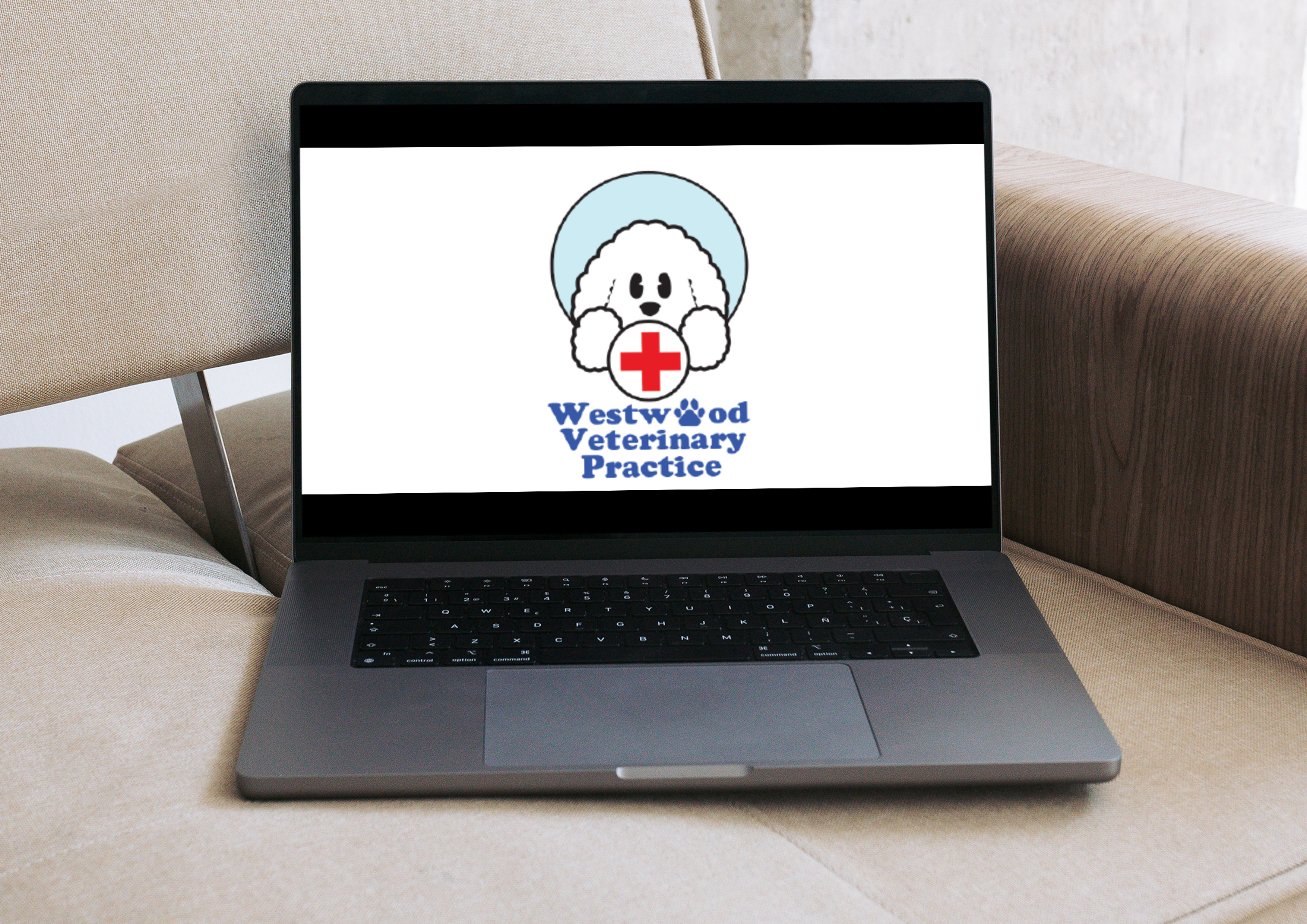
I decided I wanted to create a cute and eye-catching design for my logo that would quickly showcase the brand's aim of providing the best health quality to animals without the need for words. The use of a cartoon dog immediately showed that animals were the focus of the company, with a large red cross-linking to healthcare and medicine. This helped to immediately represent my logo as one from a veterinary practice. Furthermore, the use of the colour blue links to calm, safety and tranquillity along with being the same colour as other logos such as the NHS, making it appropriate to use as my logo's main colour. The colours red and blue are both primary colours, meaning they stand out from each other.
My understanding of Adobe Illustrator meant that I was aware of the importance of "offset paths", which I used to ensure that my logo stood out against a white background. This was especially important as white is one of the key colours within my logo, meaning I had to ensure it didn’t blend into the background.
Lettering and Typography:
My logo redesign makes use of both typography and graphics. The lettering of this logo made use of both capital and lowercase letters in order to make the paw-print graphic stand out, which helped me further link to the business's purpose through its lettering. This design choice also helped reinforce the calm nature of the business, with full Uppercase typography often being related to aggression, the opposite of what this logo is attempting to signify.
Mixed Visual Elements
By using the name of the business "Westwood Veterinary Practice" in the logo I am able to immediately show audiences exactly which business the logo is representing. The entirety of my design uses soft edges to relate to the idea of security and a soft environment. I had the aim of making the logo look as welcoming and friendly as possible, and my choice of colour, shapes and typography helped to represent this.
Geometrics:
When creating shapes for my logo I had to ensure that I remembered the rules of a visual hierarchy, using many curved edges to create a friendly-looking avatar as the focus point of the logo. I put the main sprite graphic, the dog, at the centre of the image to make audiences focus on it and used a heavy black outline to help it stand out further. This also helped ensure that the white dog didn't blend in with a white background. The use of a red cross at the centre of the image also adheres to the visual hierarchy, with a red cross often being seen in ambulances and hospitals. This makes it a recognisable symbol and therefore had to be high in the hierarchy. My use of geometric shapes also helped me to check the scalability of my logo. I was able to make sure that the logo was visible and recognisable no matter its size or placement. I also ensured that the logo was recognisable in black and white, confirming its recognisability.
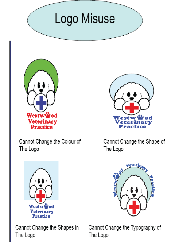
Logo Misuse:
Within the application Adobe InDesign I outlined the various ways this logo was not allowed to be used. This included not being allowed to change colour, shapes or typography. By doing this I was able to set guidelines as to the appropriate ways the logo could be used, and avoid any possible future issues of the logo being in any way misused.